Embossing and debossing are two classic print finishing techniques that add a tactile dimension to otherwise flat materials. In a world where so much communication is digital, these methods bring a sense of craftsmanship and physical presence that instantly elevates a printed piece. Whether used on business cards, packaging, invitations, or stationery, they create a subtle yet powerful impression both visually and through touch.
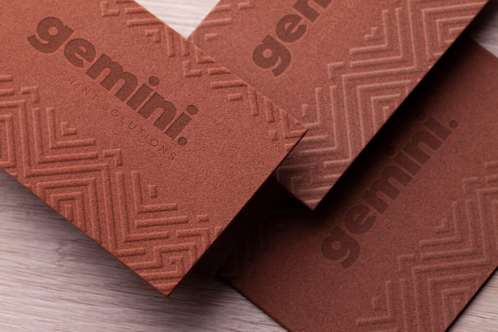
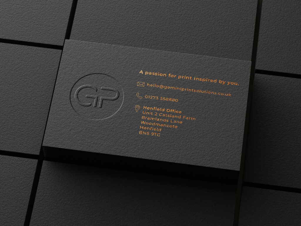
At their core, embossing and debossing are opposites. Embossing raises a design above the surface of the paper, creating a three-dimensional effect that catches light and shadow. Debossing does the reverse by pressing the design into the material, leaving an indented impression. Both techniques rely on pressure and a custom die, but the final look and feel differ in meaningful ways.
Embossing tends to feel more prominent and decorative. Because the design is lifted, it naturally draws attention and can give a sense of luxury or importance. It works particularly well for logos, monograms, and titles that need to stand out without relying on ink. When combined with foil stamping or specialty papers, embossing can look especially refined and high end.
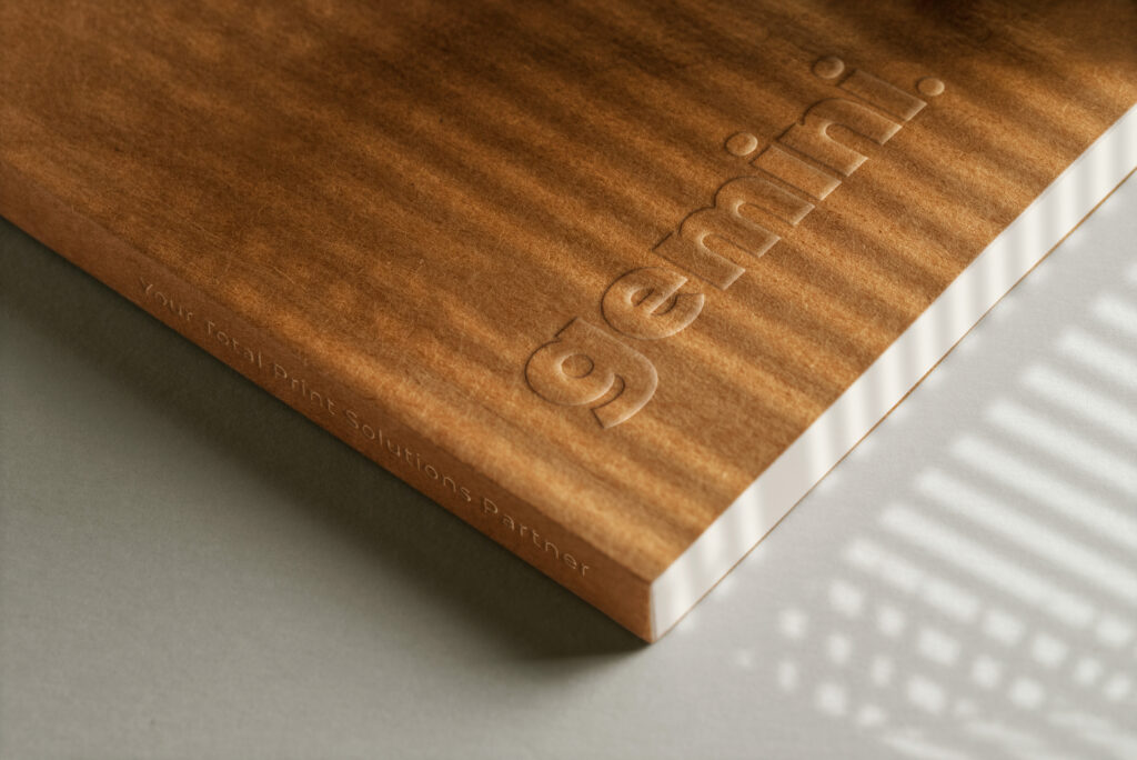
Debossing, on the other hand, is more understated. The design sits below the surface, creating a subtle shadow and a softer tactile experience. It often feels more modern and minimal, making it a popular choice for brands that want elegance without too much visual noise. Debossing can also appear more integrated with the material, as if the design is part of the paper itself rather than sitting on top of it.
Both techniques offer clear benefits beyond aesthetics. They add texture, which makes printed materials more engaging to handle and harder to ignore. This tactile quality can leave a stronger impression on the recipient, especially in settings where many printed items compete for attention. They also signal quality. The extra production step and craftsmanship involved communicate care and attention to detail, which can positively influence how a brand or message is perceived.
Another advantage is durability. Since embossing and debossing do not rely solely on ink, the design will not fade or rub off over time. This makes them particularly suitable for items that are handled frequently, such as business cards or packaging.
As for whether one is better than the other, it really depends on the goal of the design. Embossing is ideal when you want to highlight a feature and make it stand out boldly. Debossing is better when the aim is subtlety and sophistication. Neither technique is inherently superior. They simply serve different creative purposes.
In fact, combining both can produce striking results. Using embossing for key elements and debossing for supporting details can create contrast and depth that make a design feel more dynamic. When used thoughtfully, the interaction between raised and recessed areas can guide the viewer’s eye and enhance the overall composition.
Ultimately, embossing and debossing are about more than decoration. They are tools for storytelling through texture and form. By choosing the right technique or even blending both, designers and brands can create printed pieces that not only look beautiful but also feel memorable in the hands of their audience.