
When it comes to printing, colour is everything. It influences perception, evokes emotion, and reinforces brand identity. At Gemini Print Solutions, we know that achieving the perfect colour is not just desirable, it’s essential. That’s why understanding and using both Pantone and CMYK colours is a game-changer in the world of print, allowing us to deliver accurate, vibrant, and consistent results every time.


What Are Pantone Colours?
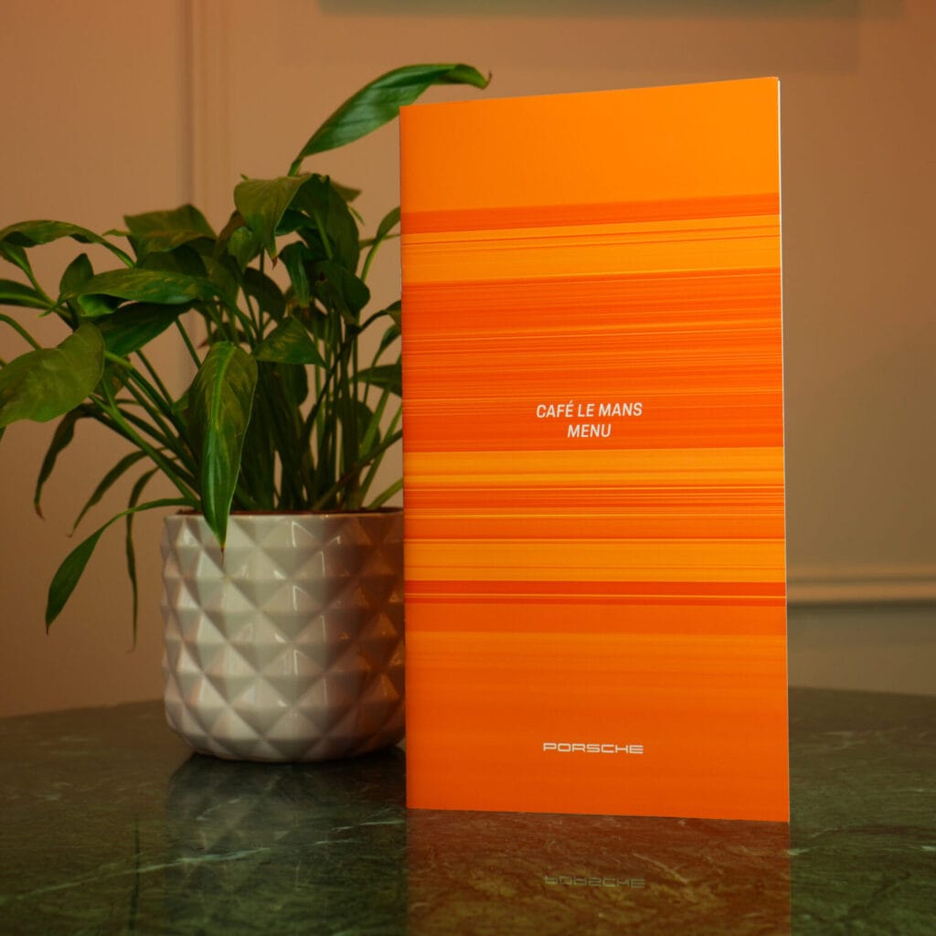
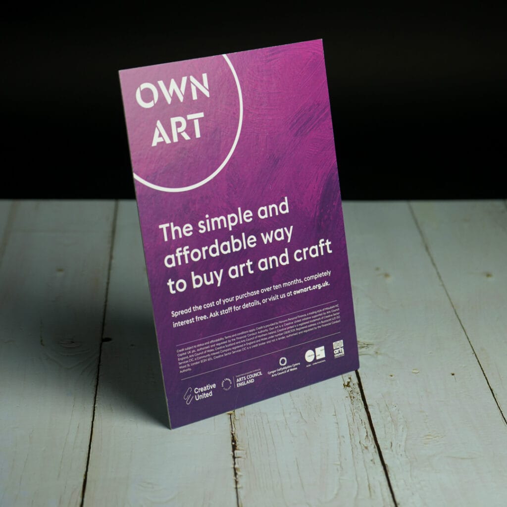
The Pantone Matching System (PMS) is the industry standard for colour reproduction. Each Pantone colour has a unique code, making it easy for designers and printers to communicate and reproduce the exact same hue across different materials and locations. From vibrant reds to soft pastels, Pantone ensures colour consistency every time.
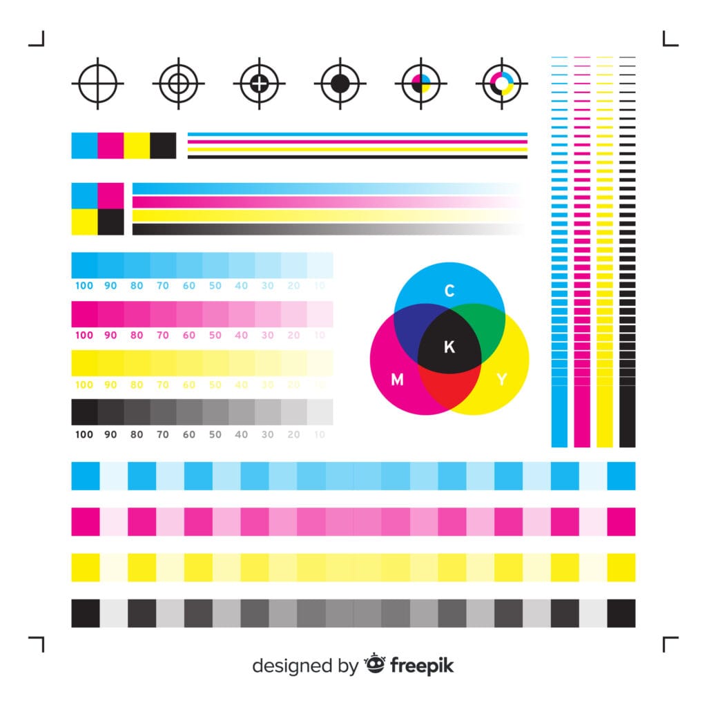
Unlike standard CMYK printing, which mixes four inks (cyan, magenta, yellow, and black) to create a wide range of colours, Pantone colours are pre-mixed inks. This guarantees that the intended shade is achieved precisely, without variation.

Why Pantone and CMYK Are Important in Printing
Here’s a rewrite following your standard conclusion rules, useful tip instead of a pitch, one contextual link to litho:
Getting colour right consistently comes down to using calibrated proofing and a colour-managed workflow from file to press. If you’re working with a litho printing supplier, ask what colour management process they follow before your next job goes to print, it’s the easiest way to avoid surprises on the final result.